de-hub

Industry:
Public Sector
Credits:
UX/UI: Marta Saavedra, Csenge Csog
branding: Armel bellec, Katharina Seidel
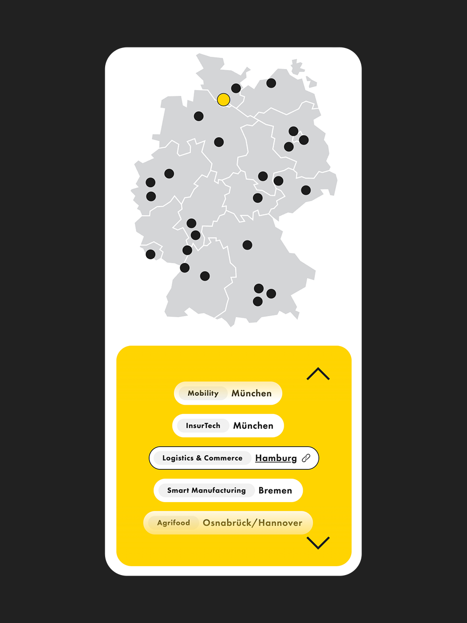
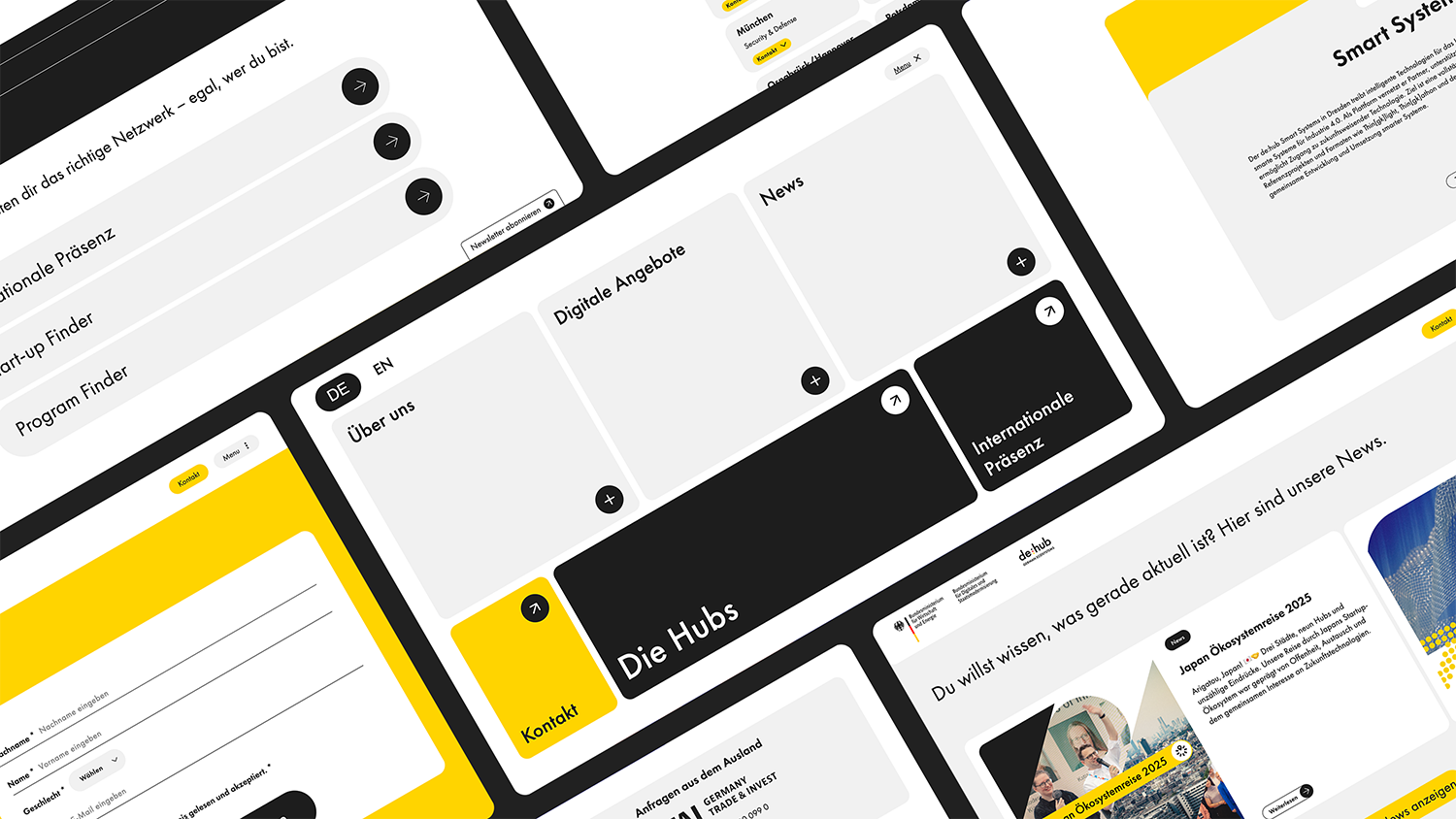
The hub of hubs
De:Hub is the Digital Initiative of the German Federal Ministry of Financial Affairs and Climate Action. In 2024 we identified a problem with the brand: it’s visual identity through different communication platforms was disperse, as Social Media and Website was being developed independently from each other by different designers.
As a solution, we gathered Art Directors and UX/UI designers to do a refresh of the brand. As a second step, we reviewed both Digital Design and UX/UI design Systems and then adapted the new brand to these ecosystems, aligning the new visual communication of De:Hub — In social media our assets need to stand out in the mist of several other visual stimuli, while on the website we can give focus to the content and allow a pleasant experience to the user by toning down the brand and highlighting strategic sections.

Besins
Industry:
Health
Credits:
UX/UI: Marta Saavedra, Csenge Csog, Giuliana Mei
Concept: Georg Castens
Art Direction: Connor Wilson, Dennis Habieb, Marta Saavedra
Deine Wechseljahre verstehen
Advertisement in the Health industry has different rules: certain products can't be promoted directly, which is the case of Hormonal Replacement Therapy (HRT). So instead, we created an awareness campaign that informs, helps and directs people to visit the doctor.
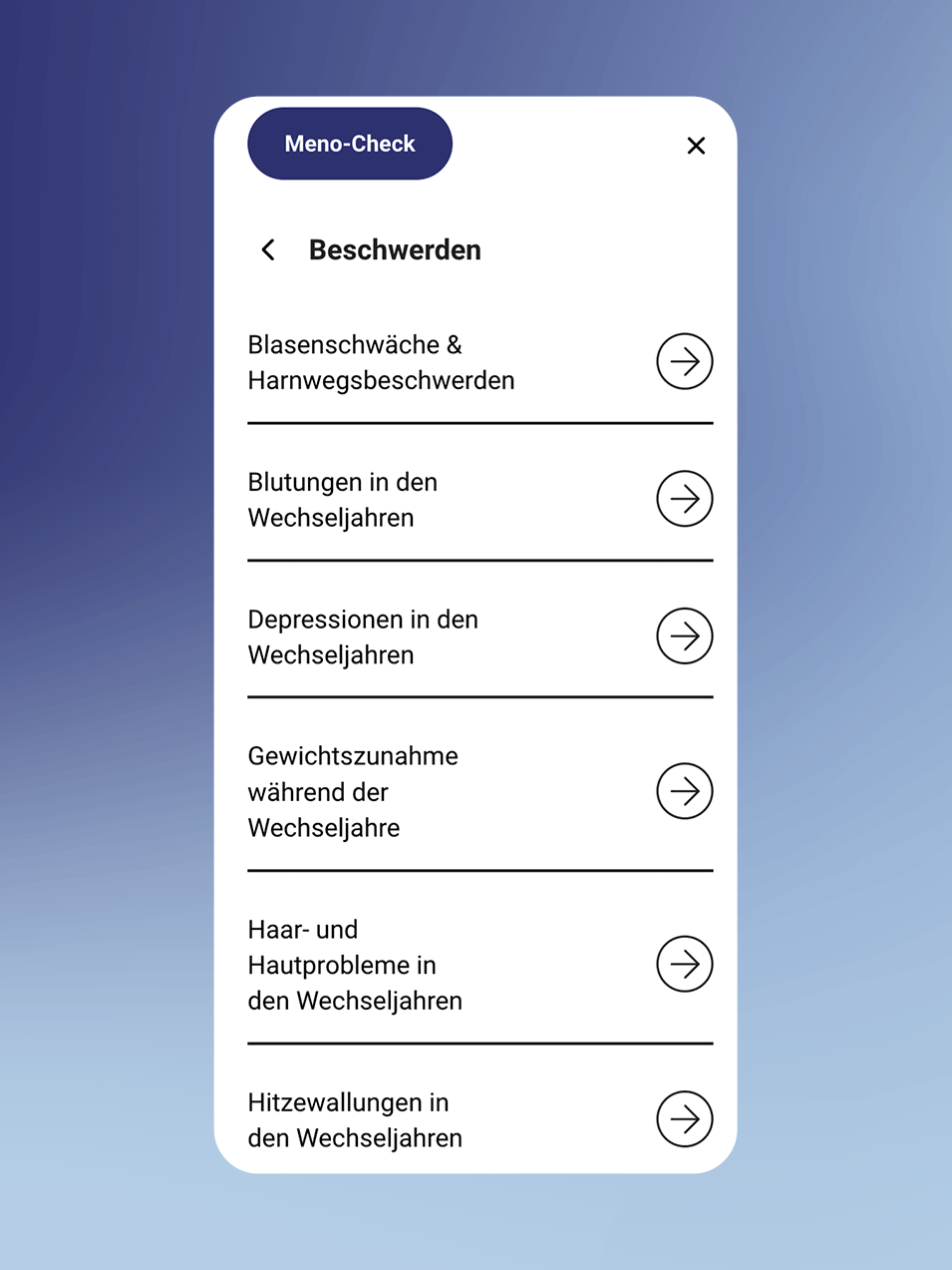
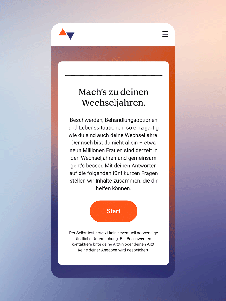
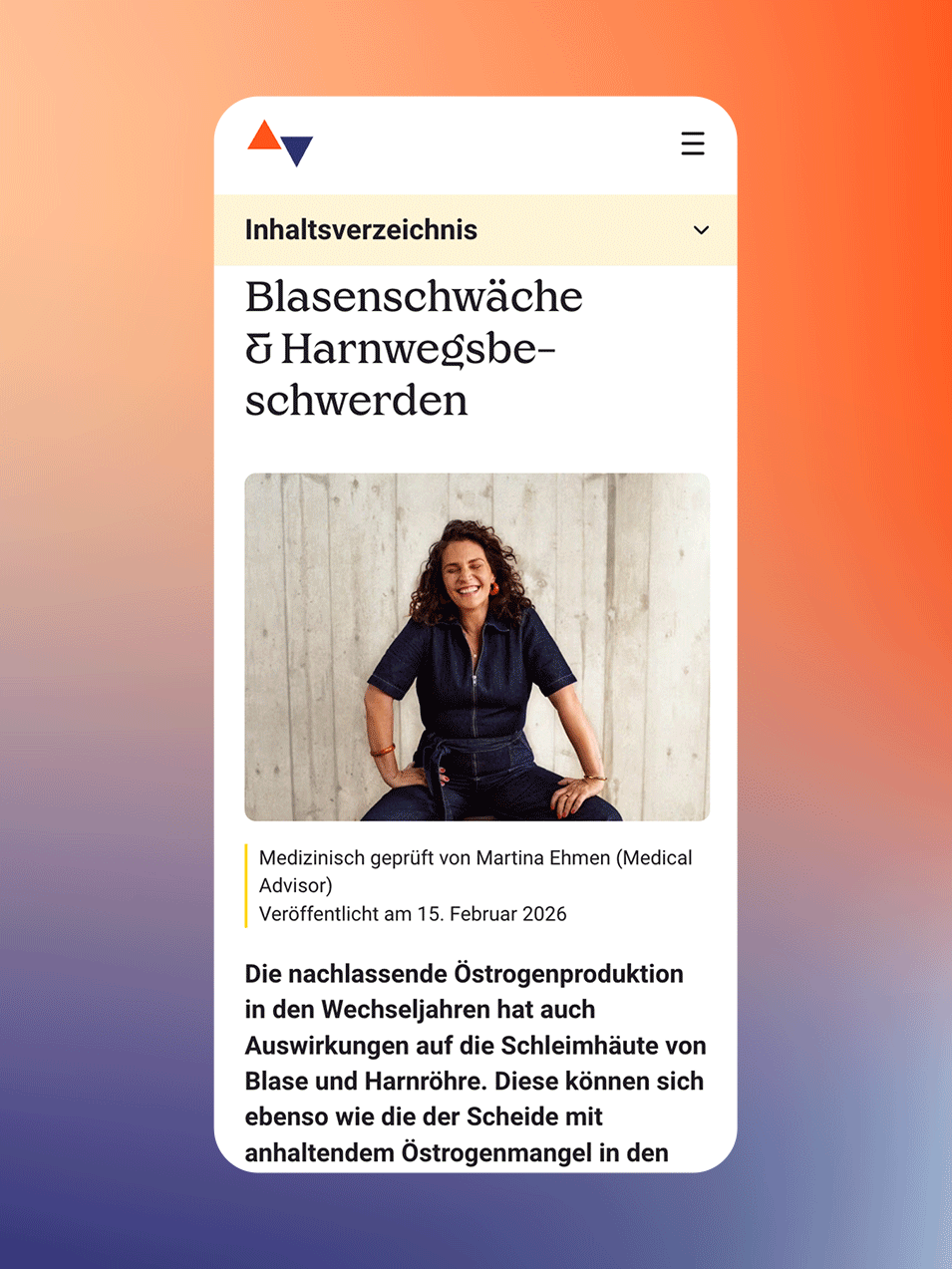
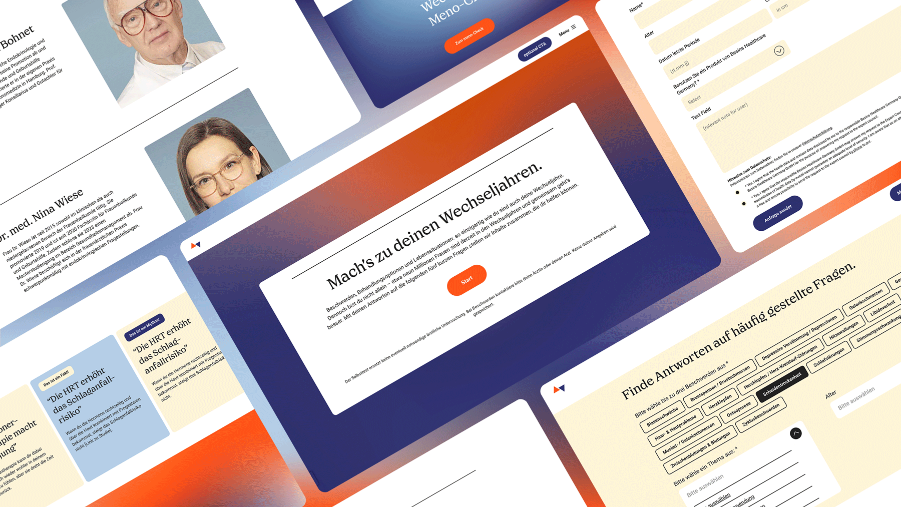
The campaign approaches the topic of menopause in a empathetic and positive way, focusing on symptoms and experiences of real women. The ads would then lead women to an information Hub focused on providing clear, trustworthy information about menopause and perimenopause. Designed as an accessible knowledge hub, the website explains symptoms, hormonal changes and treatment options. Its goal is to reduce uncertainty around the menopause journey and support informed decision-making. Beyond educational content, the platform integrates interactive tools such as self-assessments and practical guidance to create a more personalized user experience. The combination of medical credibility, empathetic tone, and user-friendly design positions the site as a supportive digital companion for women navigating this life stage.
Apart from integrating the Art direction team, participating in the workflows of the campaign design, shooting and film production, I also led the website relaunch. This process started with an audit to the existent website, understanding the painpoints and what needed to be improved. The next step was aligning the campaign design with a new user-friendly design system. All in all, this project was a 360° creative deepdive.
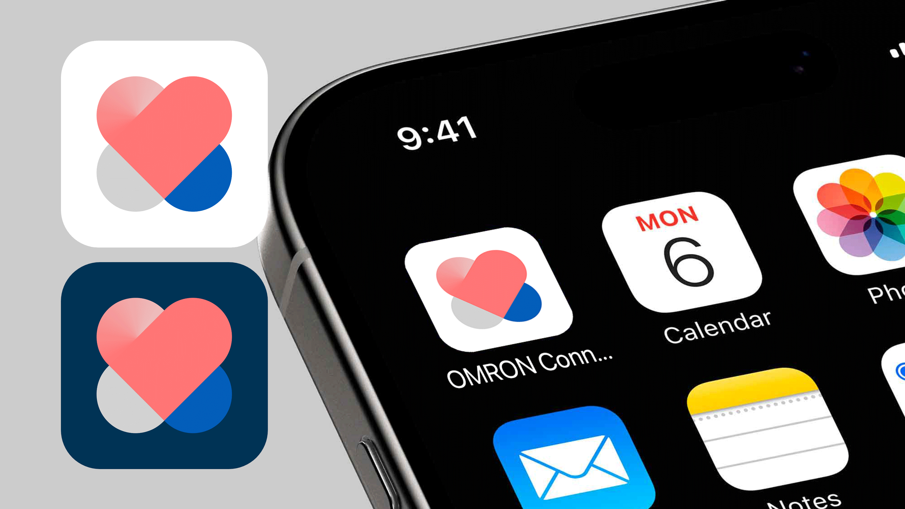
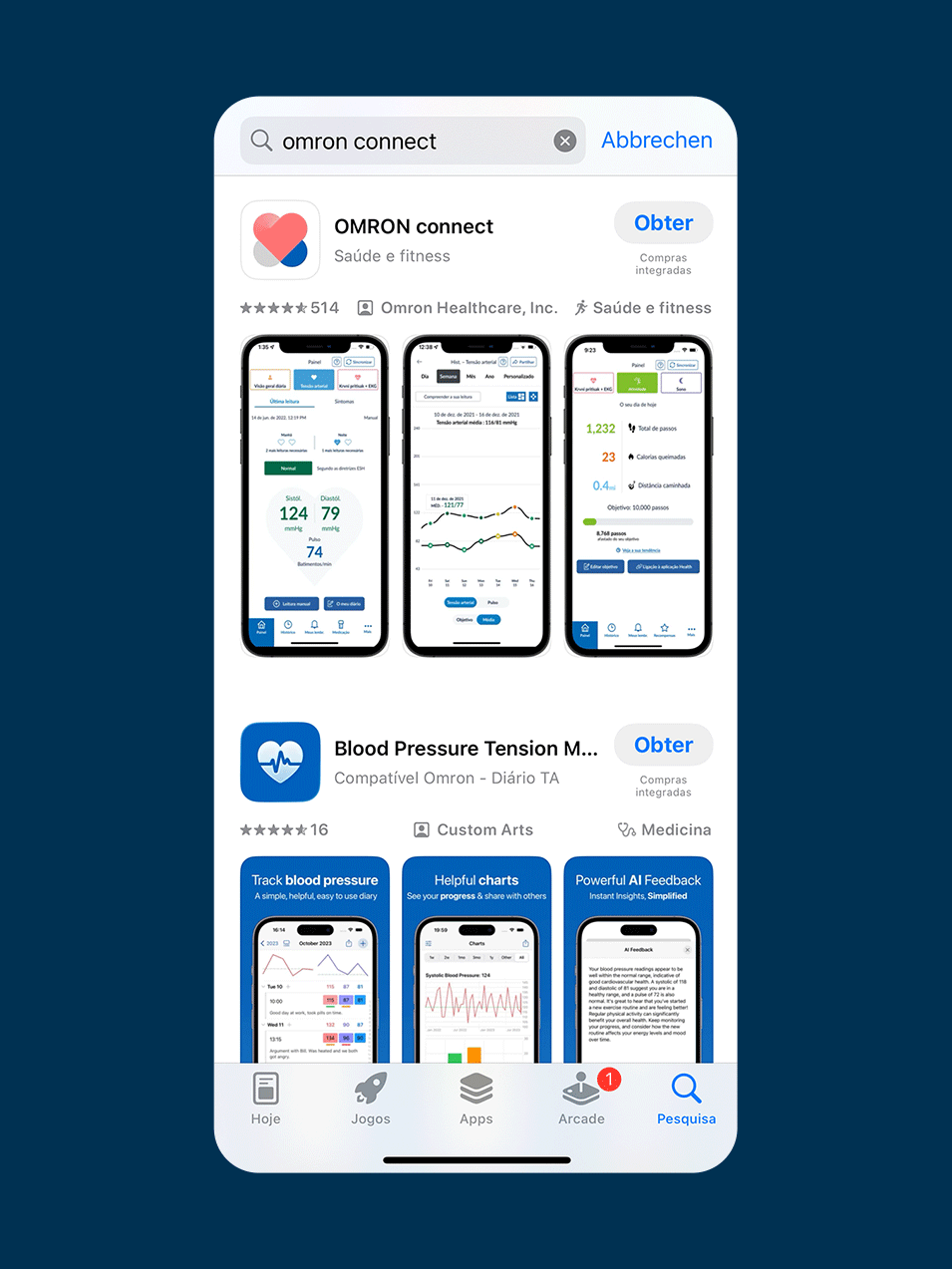
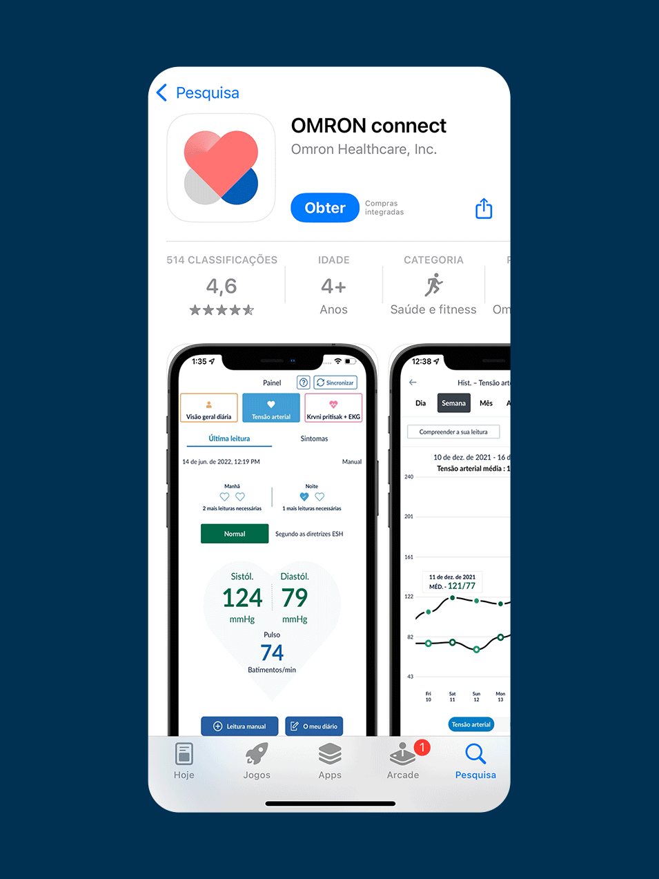
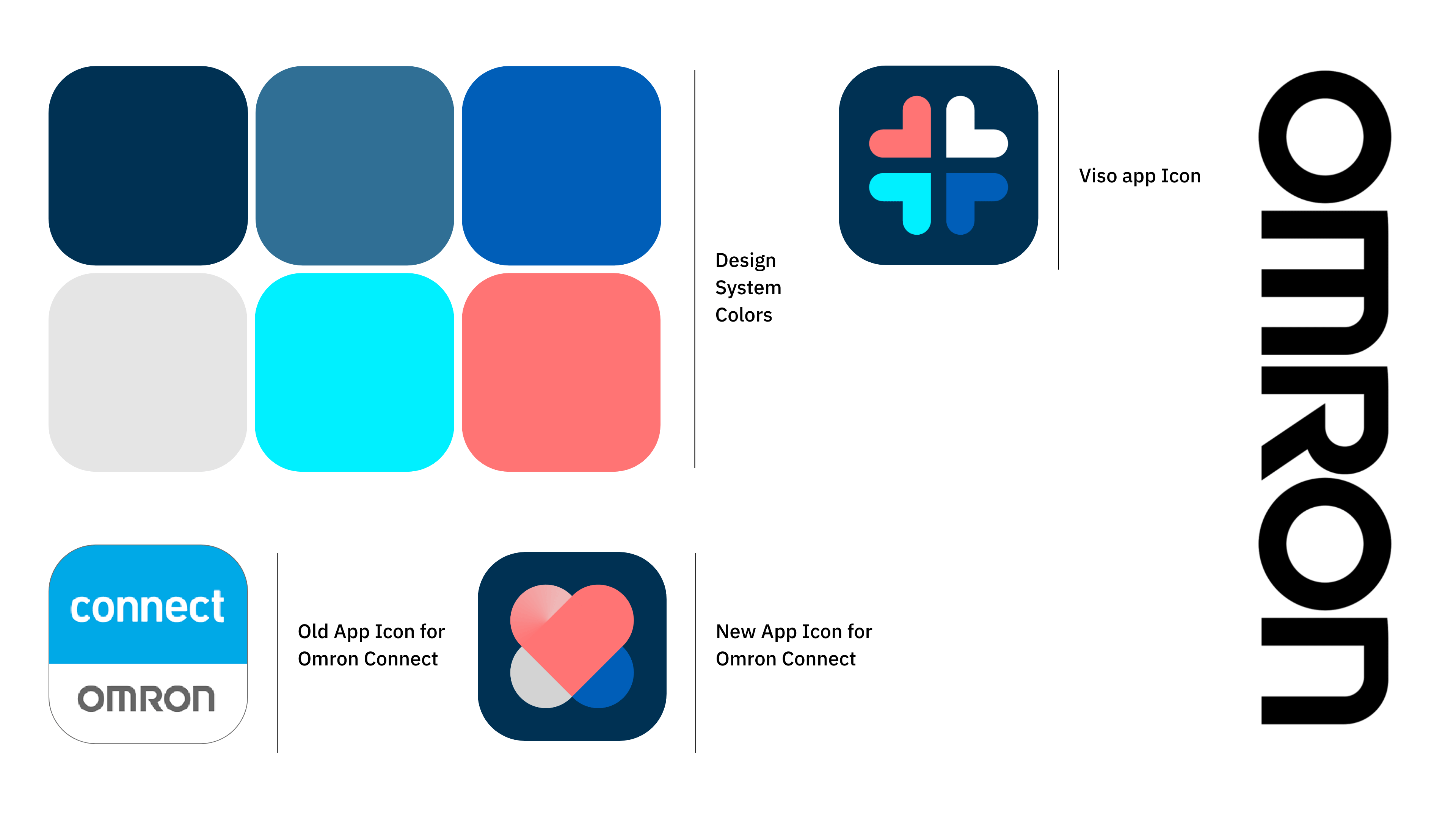
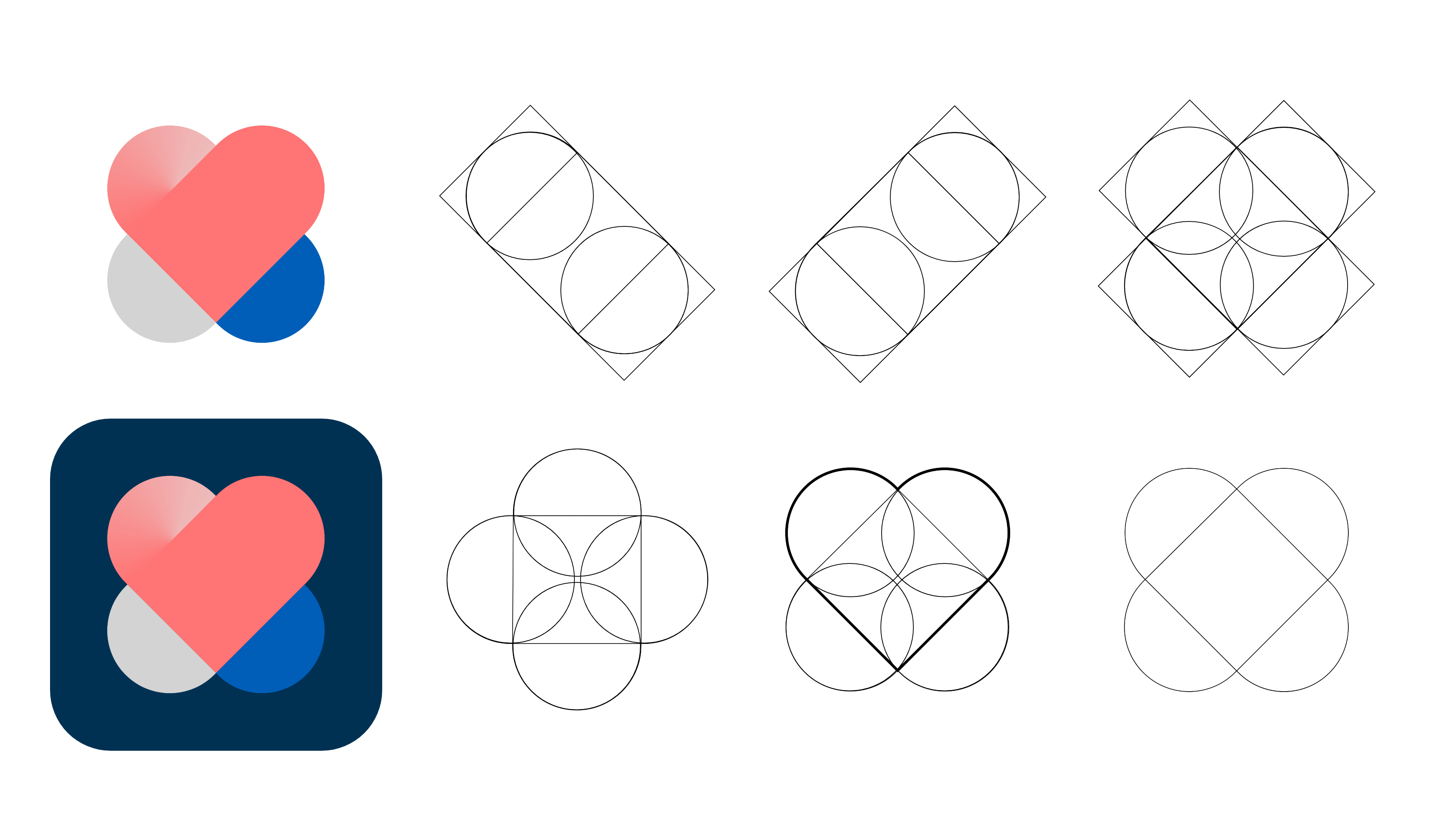
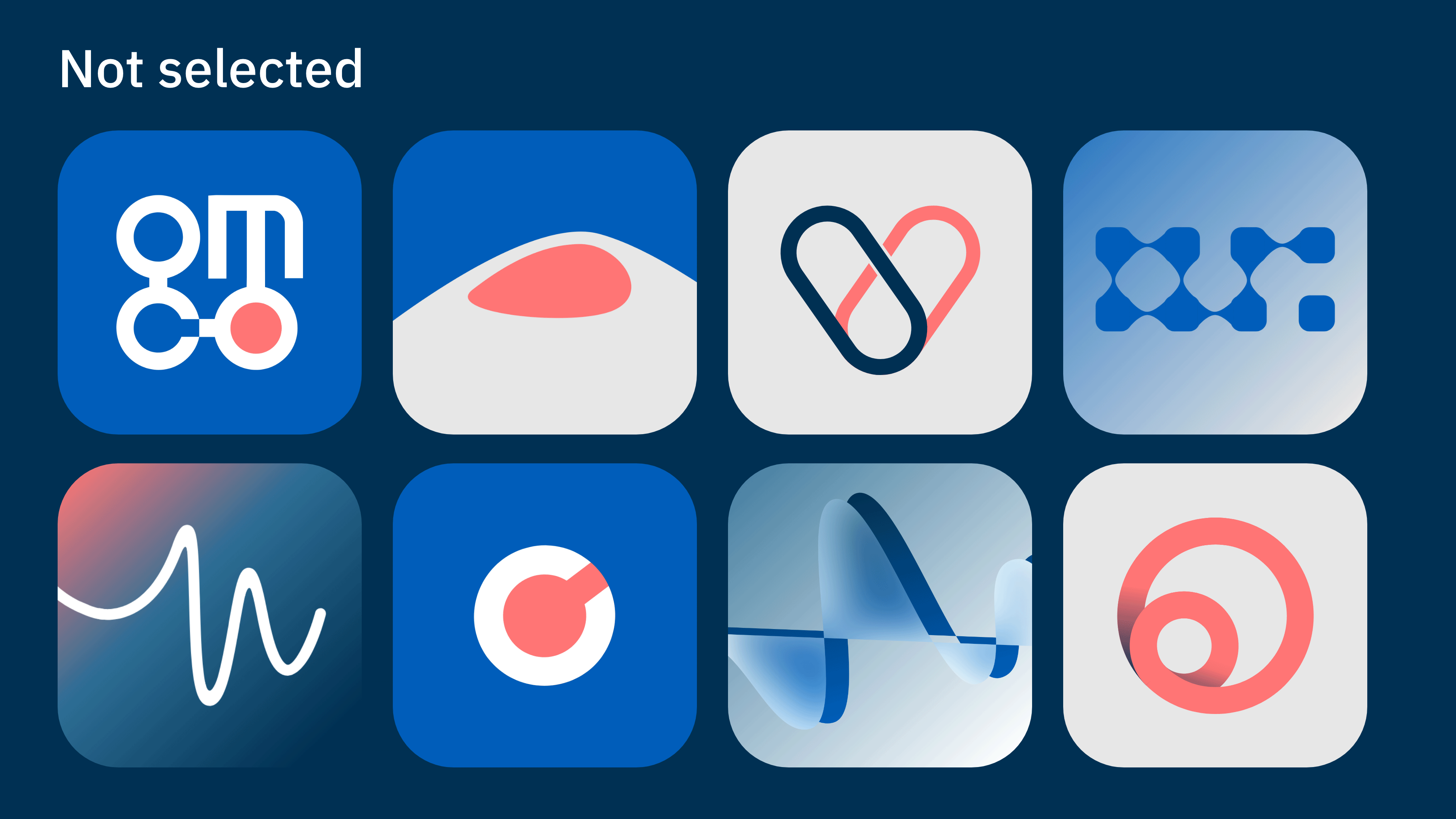
Omron connect
Industry:
Healthcare
Credits:
Branding: Armel Bellec, Marta Saavedra, Toufik Akiki
Strategy: Kimberley Laureano
Identity
Omron connect is a free App that "collects and consolidates the data from OMRON devices and other tracking apps", allowing the user to centralize his heart health information and sharing it with his doctor. Omron relauched the App in 2026 with a more user-friendly design, and approached us requesting a re-branding of their icon to reflect the updated interface of their product.
App Icons are interesting projects because they align branding strategy with UX/UI principles, such as accessibility and adaptability to cross context in digital devices.
Apps are not only competing amongst industry competitors, but essentially with the screen: how can you simoultaneously be easily identified and stand out from a sea of other icons that steal user's attention? – by creating a memorable system.
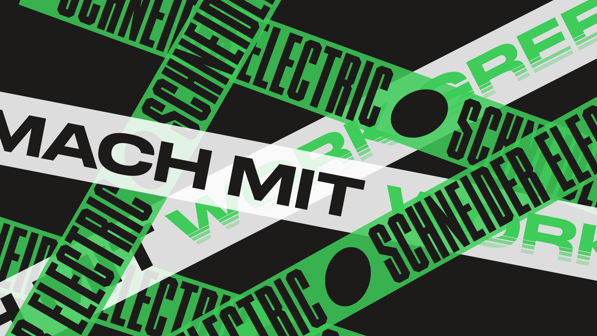
Schneider Electric
Industry:
Energy & Sustainability, B2B
Credits:
Creative Direction: Sven Herkt
Art Direction: Marta Saavedra, Raquel Vega
Motion Design: Konstantin Köhler
Work Green
This Employer Branding Campaign for Schneider Electric was set in the DACH region with the claim “Work Green” — focusing not only on the benefits of the job, but also on the environmental impact. A whole Design System was projected to unify all formats and expand the production of the headline in different applications – static and animated Social Media formats, Merchandising and Fair Booths. We also created an animation style to fit the campaign identity which was applied to Instagram story Ads, supporting the holistic approach of symbiosis between layout, graphic identity, motion and imagery.


Ecocare
Industry:
Health, B2C
Credits:
Creative Direction: Sven Herkt
Brand Design & Art Direction: Armel Bellec, Csenge Csog, Marta Saavedra
Your healthcare companion
Ecocare is a Digital Health Brand that develops medical products and distributes them through remote places around the world. Since their first contact with the consumer is an online experience, the branding had a focus on the digital application of their identity. In order to develop a brand with a presence on several cultural contexts, the logo was carefully curated to evoke and at the same time distance itself from the literal shape of a cross, bringing the digital DNA to it’s visual representation. With a mix between healthcare and life style, we wanted to turn the health industry more approachable and digital friendly, considering visual accessibility and a positive resonance between the consumer and the brand experience.


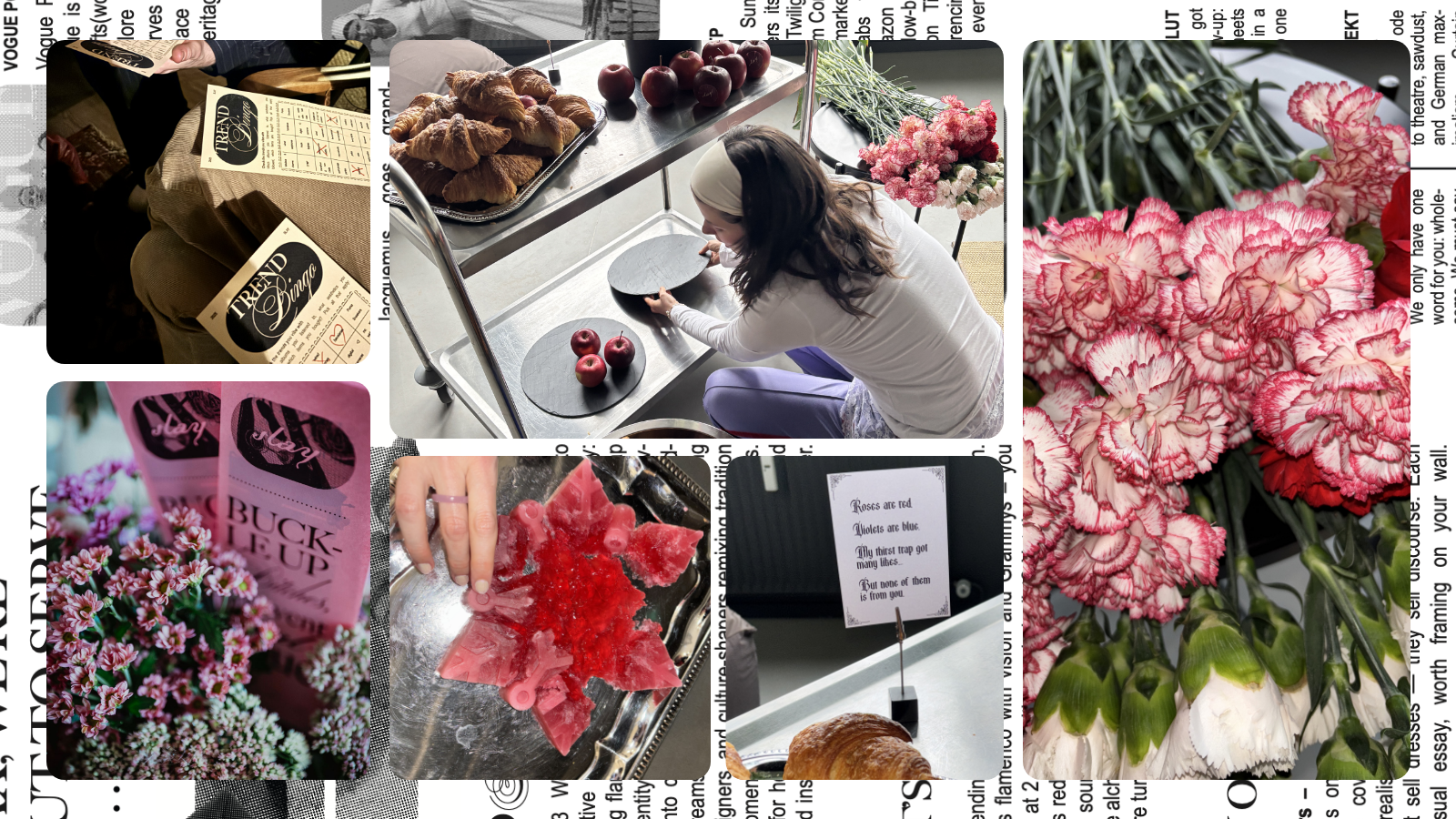
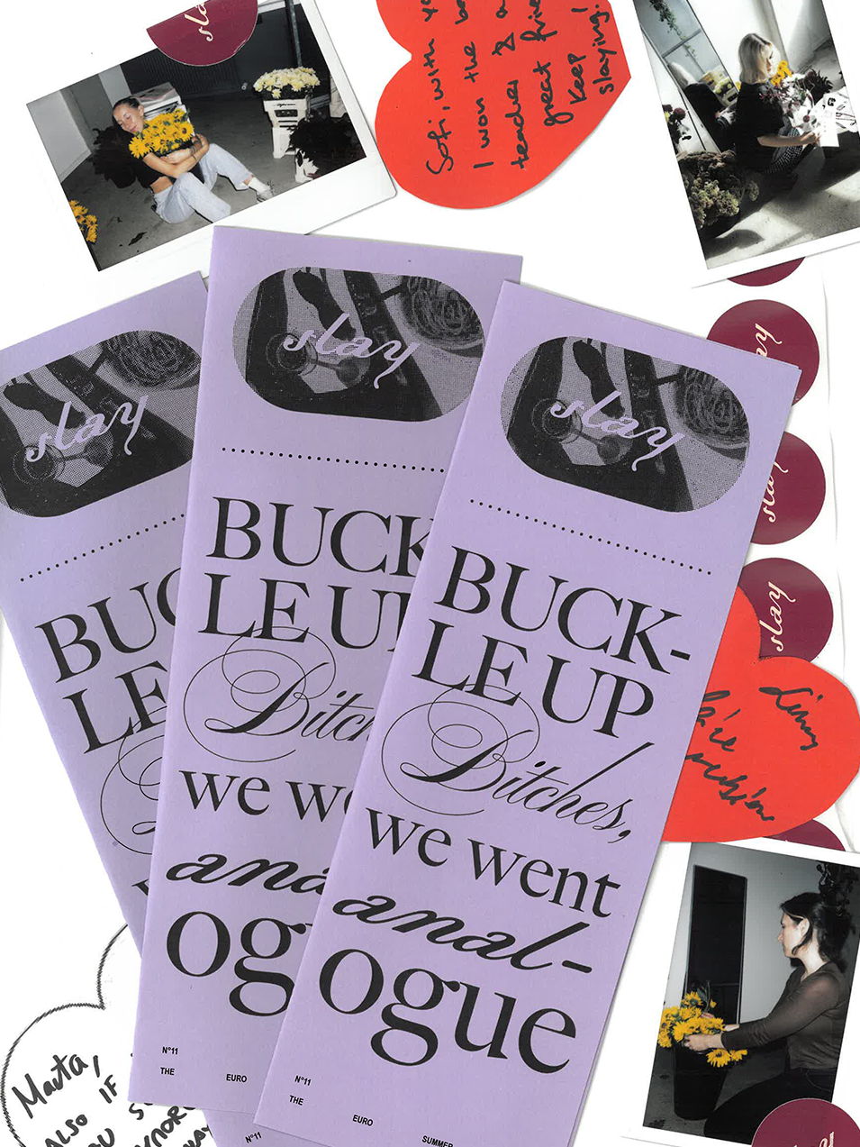
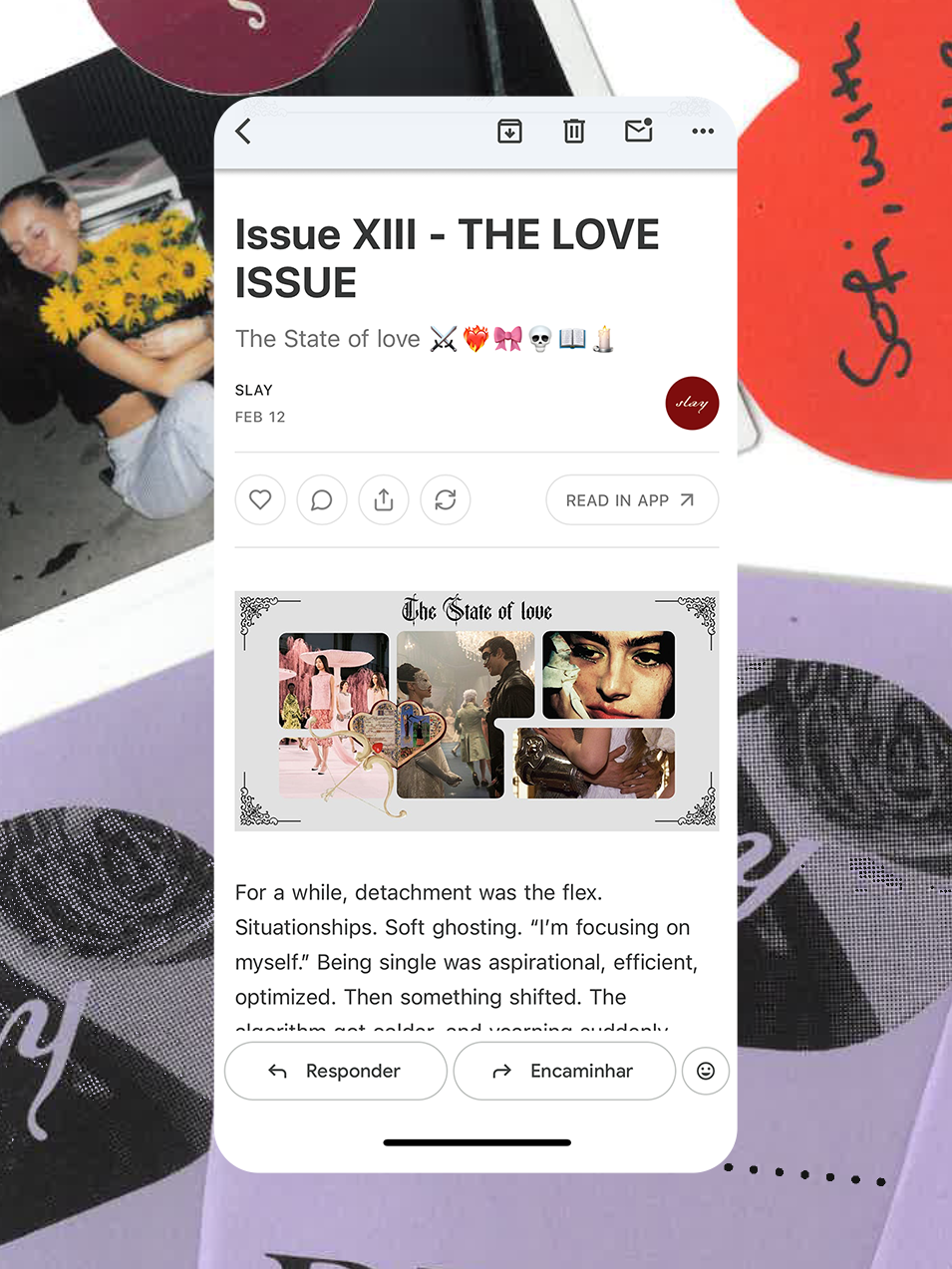
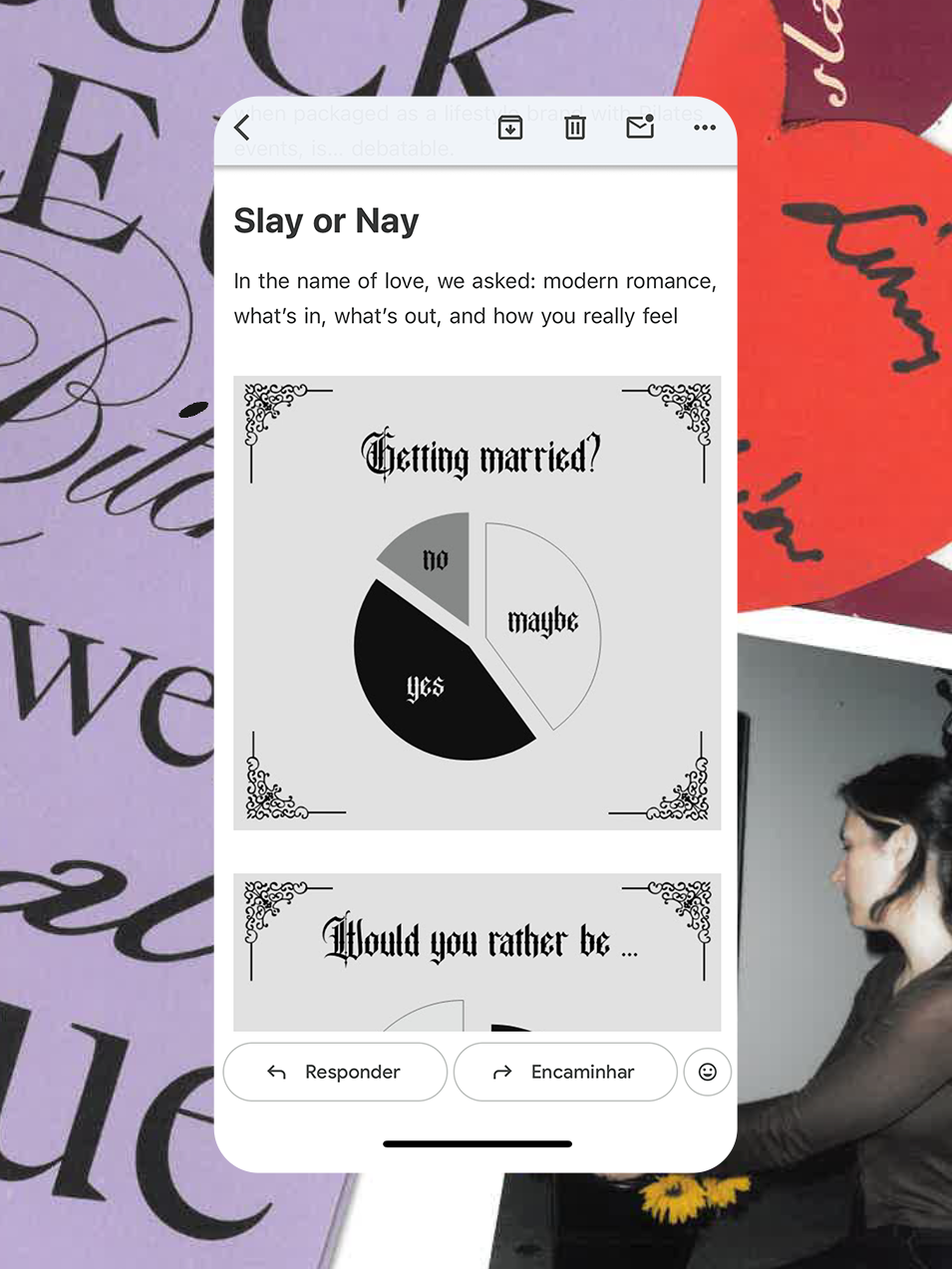
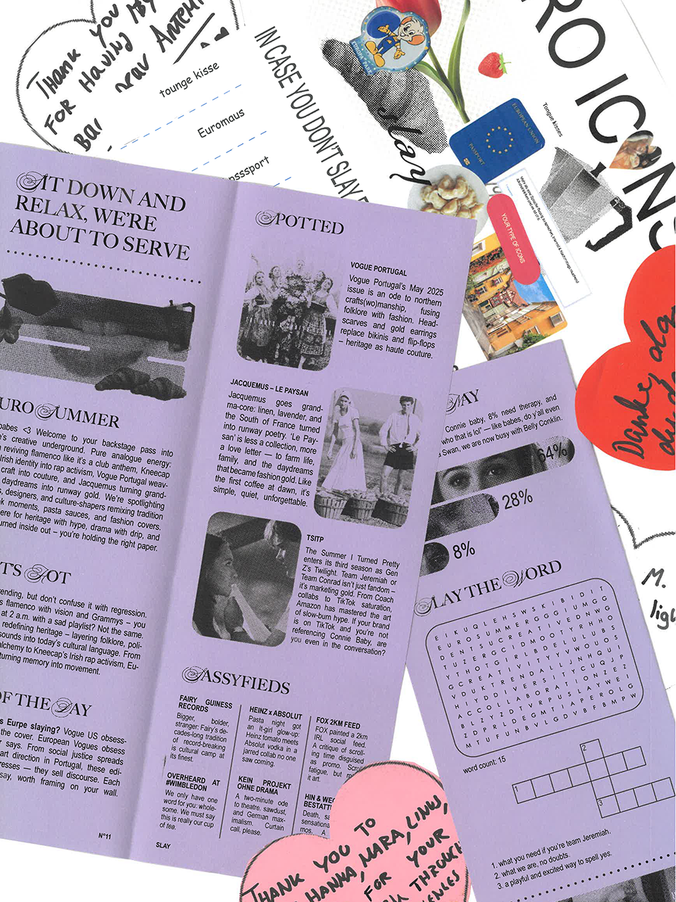
Slay Newsletter
Industry:
PR, Culture, GenZ
Credits:
Concept & writing: Csenge Csog, Giuliana Mei, Kimberly Laureano,
Marta Saavedra
Design & Art Direction: Csenge Csog, Giuliana Mei, Marta Saavedra
Scene Design: Csenge Csog
Roses are Red, Violets are blue, you think about us, and we think about you <3
Blending lifestyle-driven content with a pinch of playfulness and feminine energy, this publication serves as a platform for visual and written expression that reflects our aesthetic values and engagement with culture as authors. We focus on self-expression, creativity and humor, while creating community-oriented content that resonate with the audience interests in creative culture, identity, and personal storytelling – an example of building a niche creative presence on Substack as both a branding and audience-building exercise.
More than a Newsletter about marketing and GenZ culture, Slay became a native brand in a very organic way: through IRL activations and digital engagements, we get to know our audience and give them what they crave. Our ultimate goal is to have fun ourselves, and promote fun to whomever reads it.
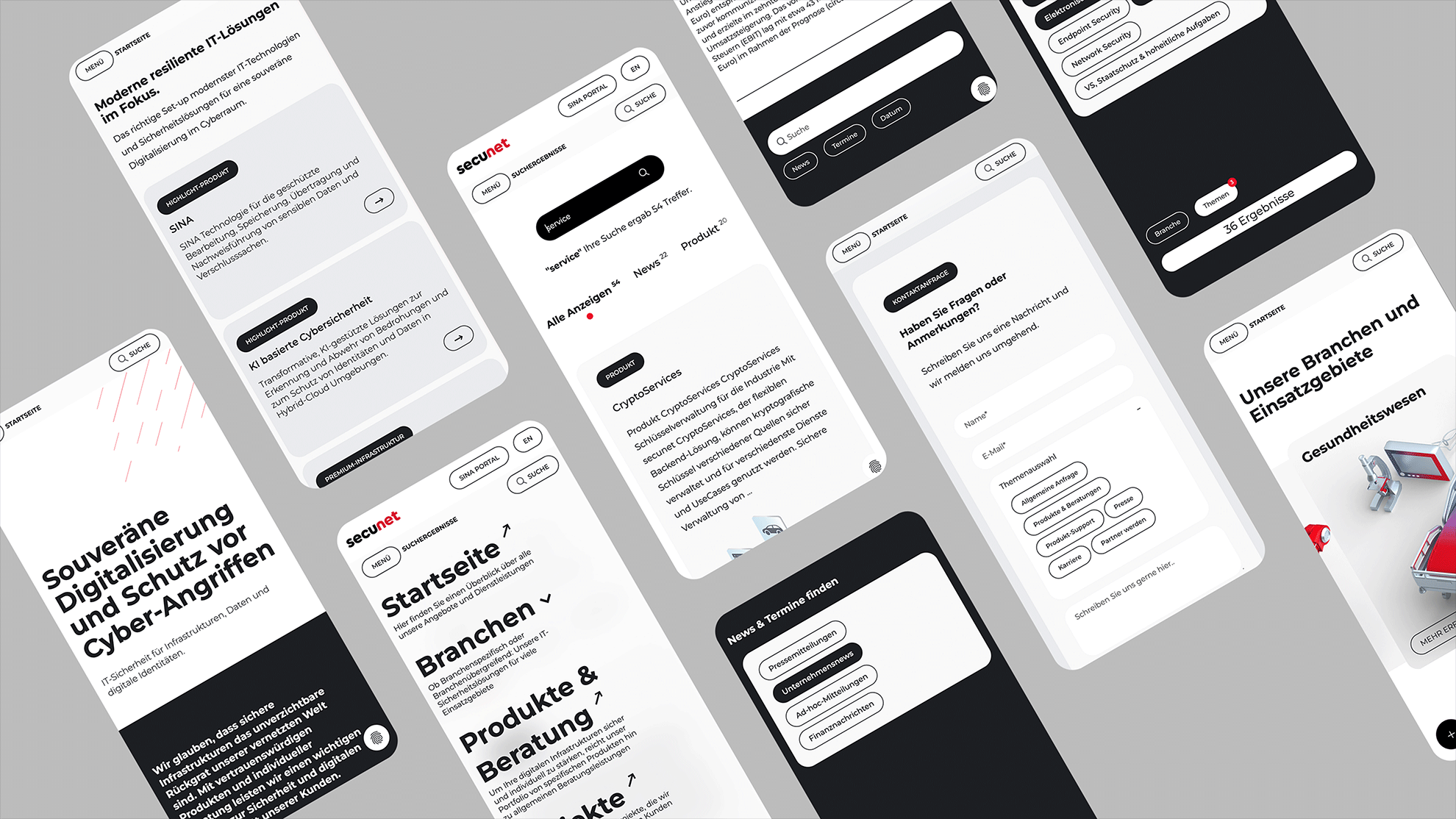
Secunet
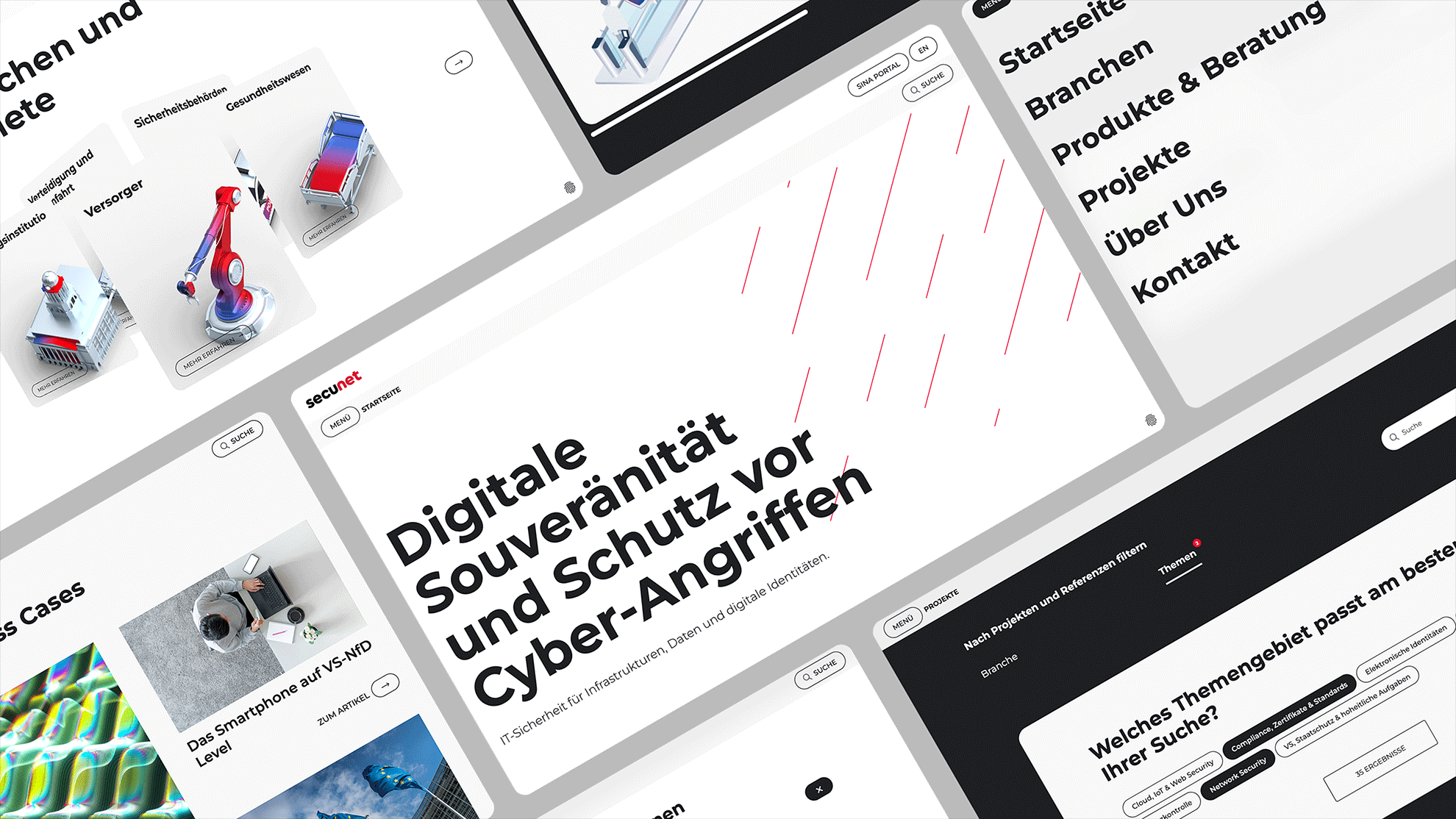
Industry:
Security, Digitalization
Credits:
Creative Direction: Sven Herkt
UX/UI Design: David Adeoye, Marta Saavedra, Paula Chisari
IT Security
In order to follow the pace of a fast digital progress along with their users needs, Secunet shifted their brand into a digital first perspective with a focus on their website as the main hub and touchpoint with their clients. We readapted the brand colors and developed a whole new design system for the website with a strong typographical approach, illustrative infographics and smooth animations. The website counts with product finders, contact and newsletter forms, News section, and an additional online magazine and a microsite system.


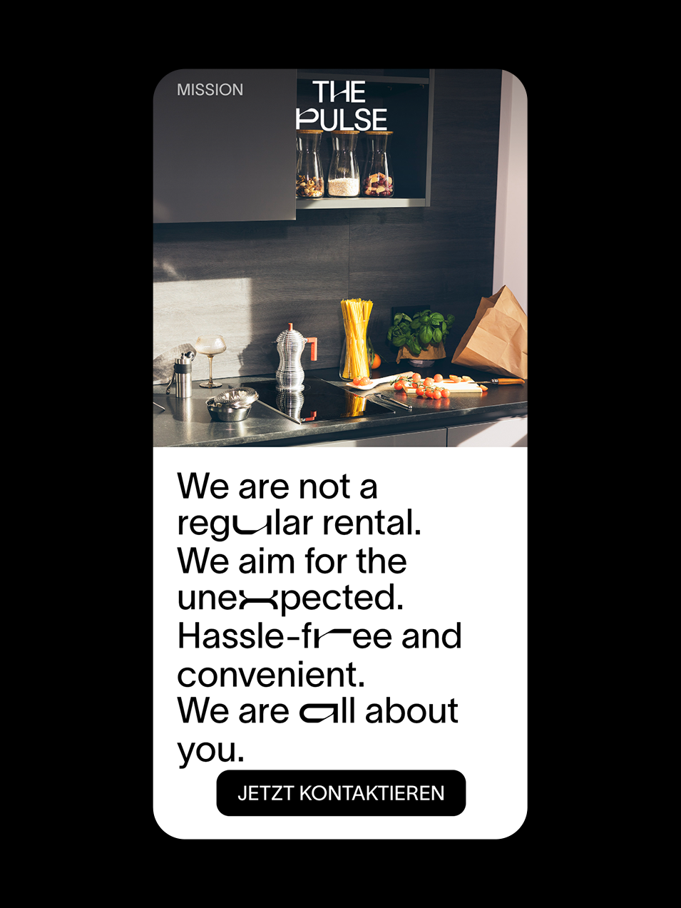
The Pulse
Industry:
Real Estate
Credits:
Creative Direction: Sven Herkt
Brand Design: Armel Bellec, Akim Sänders, Csenge Csog
Art Direction: Marta Saavedra
Photography & Post Production: Janek Stroisch
Urban Luxury Meets Home Comfort
For a rebranding and website relaunch for this luxurious coliving space in Frankfurt, we conducted a photoshoot that was used on the Homepage. The Art Direction process was planning a visual style, lightning and narrative, creating scenarios with prompts that were chosen to detail. For the conceptualized narrative we created a user persona based on the most likely target group — young corporate workers from the banking and business industry. With this holistic approached, we aligned UX methods to Art Direction, thinking of the brand as a whole. As a main goal we wanted to explore relatable experiences in spaces that tend to be traditionally showcased as emptied and without a human presence.


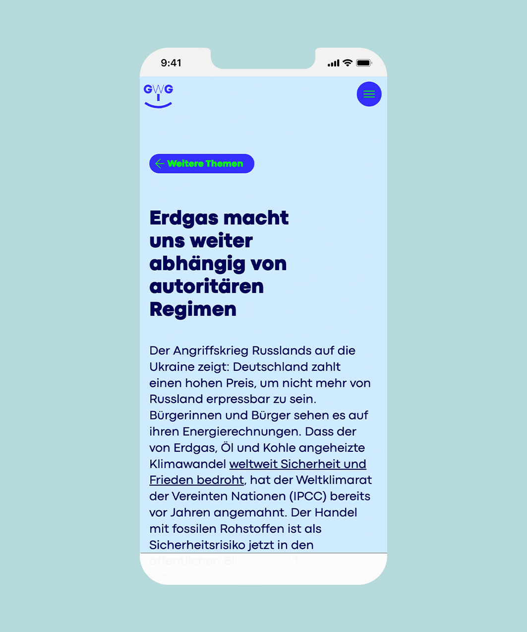
Gas War Gestern
Industry:
Sustainability, Politics
Credits:
Creative Direction: Sven Herkt
Brand Design: Akim Sänders, Raquel Vega
UX / UI: Marta Saavedra, Csenge Csog
Copy & Concept: Georg Carstens
Campaign Design: Dennis Habieb, Manuela Ladu
Erdgas hat keine Zukunft
Gas War Gestern is a Campaign that counts with a Landing Page as a information Hub – which showcases several research articles on the topic of the Future of Energy. The campaign came out during a period of gas prices inflation and a political context of redirection towards renewable energy resources. Its purpose is to continuously educate the users on topics of clean energy and the consequences of natural gas consumption. Due to the heavy text pages and lack of imagery resources, the brand was thought to be more graphical and colorful. All compoenents are visually accessible and animated graphic elements were introduced to counterbalance the staticness of the text blocks.

Boehringer Ingelheim
Industry:
Healthcare
Credits:
Campaign Design: Armel Bellec, Dennis Habieb, Paula Alexander
UX / UI: Marta Saavedra, Giuliana Mei
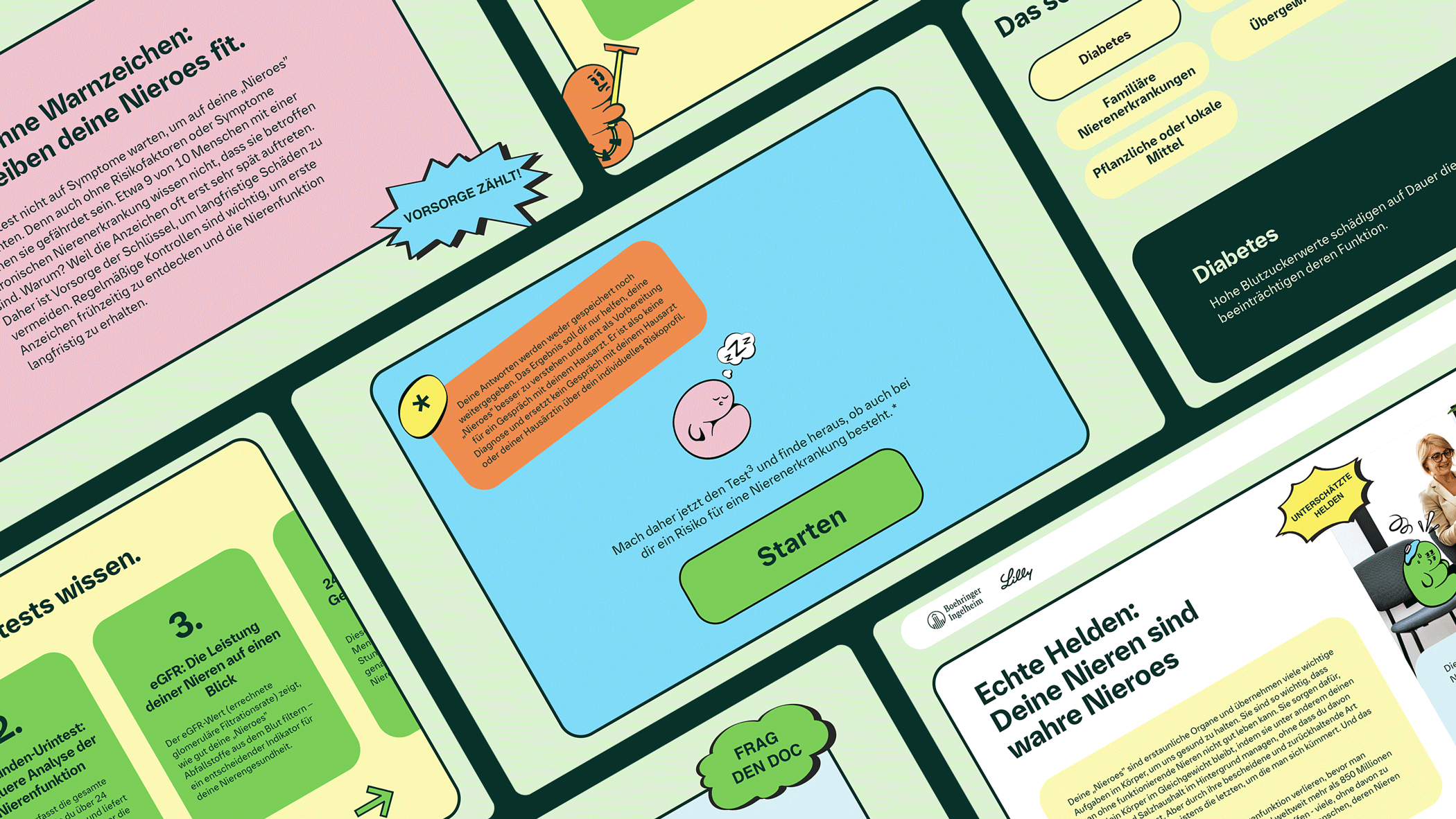
From Nieren to Nieroes
For their Kidney Health Awareness Campaign we developed an information hub Landing Page with a quiz that engages users to listen to their bodies and learn more about preventive measures. Starting with print flyers in doctor’s offices, clinics, and a social media targeting campaign, the user is redirected to the Landing Page where, after gathering information, they can download a couple of questions to ask their doctor and/or book an appointment via a doctolib link.


Grüenderland Bayern

Industry:
Public Sector
Credits:
UX research: Marta Saavedra, Giuliana Mei
How is the chatbot being preceived by the users?
“Leo,” the Gründerland Bayern chatbot, was created to help users navigate the platform’s extensive content and services. However, analytics revealed low engagement, unclear perceived value, and early drop-offs within the conversation flow. The challenge was to uncover why the chatbot wasn’t fulfilling its intended purpose and to identify concrete UX, content, and structural improvements that would make the tool genuinely helpful for founders seeking guidance.
The project resulted in a clear set of evidence-based recommendations for improving the chatbot’s usability, relevance, and overall perception. Through a heuristic UX audit, analysis of usage data, and moderated user interviews, we identified key friction points — including unclear entry points, insufficient communication of the chatbot’s purpose, and a lack of contextual triggers guiding users toward Leo at the right moments. These insights were translated into actionable improvements: refined conversational framing, a more prominent and strategically placed access point, better expectation-setting, and the integration of contextual relevance cues rather than passive availability. The outcome is a roadmap that enables Gründerland Bayern to reposition Leo as a meaningful, supportive touchpoint in the founder journey, rather than a peripheral feature.
